

Wednesday, October 30, 2013
Tuesday, October 29, 2013

Wednesday, October 23, 2013
Writing Assignment: Helvetica The Movie [10/23/13]
Helvetica "The Movie" Assignment
Helvetica originated in Switzerland, created by Alfred Hoffman
The original name was something like Die Huesf Hoi Dagsheck. It was going to be named Helvecia, which is the latin name for Switzerland, but was altered slightly to Helvetica, or "the font of Switzerland".
Helvetica was created in the year 1957.
Helvetica became popular because it introduced a modern, legible style that could be used rationally anywhere.
3 different design tips:
- Space around the shape of an object is what really makes the shape.
- Neutralism is preferred.
- Design things so that they feel as natural and present as air.
Insight about design from the movie:
- The design of any one thing can be extremely qualitative in its full scope.
- There's two types of design: corporate design, and everything else.
- Every style of design has its own era, and the history of how it has been used really effects how people look at it in the future.
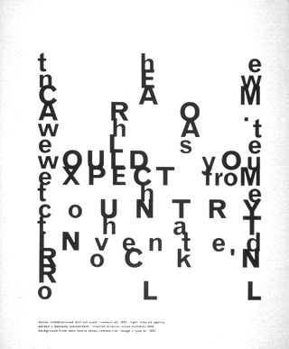
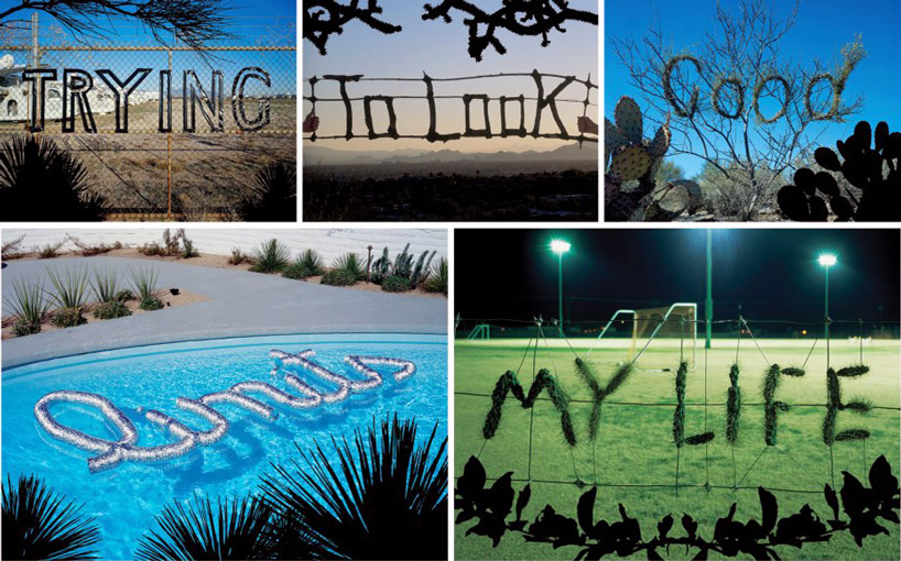
Some examples of Helvetica on campus:


Designers in the Film:
Paula Scher
- Scher has been working for Pentagram, a committee of designers for over 20 years.
- Began her art career between the 1970's and 1980's with a great interest in typography.
- She has been featured in countless magazines and sitcoms, and has received many medals and awards for her forward thinking in design.


The Maps Project: http://www.themapsproject.net/artist-who-mapped/paula-scher/
Biography: http://www.aiga.org/medalist-paulascher/
David Carson
- Head of David Carson Design, Inc.
- Featured in hundreds of magazines and newspapers worldwide.
- Wrote a book with Lewis Blackwell, became one of the top selling graphic design books of all time.
Website: http://www.davidcarsondesign.com
Biography: http://www.davidcarsondesign.com/t/about/
Stefan Sagmeister
- Notoriously known for completely scrapping the traditional methods of design and using his own style.
- Had his own body carved to be featured on a poster to advertise an event.
- Considered one of the more bizarre graphic designers, constantly reinventing his style into something stranger.
Website: http://www.sagmeisterwalsh.com
Michael C. Place
- Founded the design studio Build.
- His designs are widely accepted as ingenious.
- Experiments with a great variety of type fonts in a simplistic style.
- Founded the design studio Build.
- His designs are widely accepted as ingenious.
- Experiments with a great variety of type fonts in a simplistic style.

Website: http://wearebuild.com
Monday, October 21, 2013

Tuesday, October 15, 2013


Friday, October 11, 2013

Design Principals and Elements Notes [10/11/13]
Design
The Principals and Elements
"People ignore design that ignores people."
- Frank Chimero
Design is all about putting things together that looks good.
The Principals and Elements
"People ignore design that ignores people."
- Frank Chimero
Design is all about putting things together that looks good.
- Design elements are the basic units of a visual image.
- The principle of design govern the relationships of the elements used and organize the composition as a whole.
- All imagery, art, and photography alike, are comprised of elements that can be broken down and analyzed. This goes for web design as well.
Design Elements:
- Space
- Line
- Color
- Shape
- Texture
- Value
- Space can exist in either two or three dimensions. It can referred to as positive or negative space. It can also refer to foreground, mid, or background elements.
- Line are frequently found in hand-drawn artwork, and may or may not be uniform. You can convey the idea that there are lines where other design elements are being used.
- Color is incredibly important, it can be used to lead the eye in different directions, hide objects, change mood.
- Shapes are what help us identify objects. They can be geometric or organic, and they convey a lot of information.
- Texture plays a very interesting role, it can be implied or projected to give you an illusion that there is actual texture in the design. It can pique a lot of interest.
- Value helps convey the illusion of depth by using shading, which creates a difference between light and dark areas. Solely based on "tonal values".
Design Principals:
- Unity
- Variety
- Repetition
- Harmony
- Proximity
- Proportion
- Functionality
- Unity creates a sense of order, consistency, size and shape. It also has a lot to do with proximity, as you can display a lack of unity.
- Variety comes into play when using many different design elements to create differences between each individual object.
- Repetition is used all of the time, whether it be in objects or color.
- Harmony is found in designing something that makes something seem like it works together, yet there are many unique parts that keep it apart from generic design.
- Proximity is heavily based on how far your eye must move to get the information it needs. Smooth design might come in the shape of curves or organized grids. Simplicity is key, and space will help convey the effect of proximity.
- Proportion (Scale) are about how objects compare to each other in terms of size.
- Functionality is the most important principal. Are you creating a certain design because it looks good, or are you aiming for it to serve its purpose? You need to entertain, communicate, and inform people to keep them interested.
Wednesday, October 9, 2013


Typography Notes [10/9/13]
Typography
Aka: fonts, type, typeface
“Fonts are the clothing that
our ideas wear.”
Legibility: choose classical
time-tested typefaces.
- San Serif fonts are used for headlines.
- Never use Comic Sans.
- Serif reads best at smaller sizes (it has curls at the edges), whereas sans serif has flat edges.
- Too many fonts confuse the reader and spoil the design.
- Fonts that are too similar cause ambiguity.
- Font choices should have some contrast to each other, because they are used for emphasis.
- Readability: use upper and lower case letters for optimum clarity. All capital letters are difficulty to shouting, and is the equivalent of shouting.
- Left alignment reads easiest, consider eye flow as it moves down a page.
- Pay attention to the rag (ragged edge) of your text. (Not a good rag) ----->
- Use italics, bold, size, color, and typestyle change with discretion and without disturbing eye flow. Explore font changing last.
- Avoid stretching or distorting type, preserve its integrity. Use the shift key to scale text.
- Strive for a sense of balance. Text can hold its own weight this way. Balance can be symmetrical or asymmetrical on a page.
Monday, October 7, 2013

Subscribe to:
Posts (Atom)